Market Breadth Indicators: How to Read Advance/Decline Without Fooling Yourself
A practical framework for reading advance/decline and participation — and what to do when the index looks fine but the market underneath doesn’t.

Market breadth indicators answer a simple question that price alone can’t: how many stocks are actually participating? When an index grinds higher on the back of a handful of mega-caps, the headline chart can look healthy while the underlying market quietly deteriorates. That’s the moment breadth becomes a risk management tool — not a prediction machine.
This guide is a framework for using breadth the way professionals do: as a context layer for exposure, regime selection, and timing discipline — without treating every divergence like a crash siren.
1) The core idea: participation is the hidden variable
Cap-weighted indexes (SPY, QQQ) are dominated by their largest constituents. If the leaders catch a bid while the median stock chops or sells off, the index can still print higher highs. Breadth indicators exist to surface that internal split.
Think of breadth as a “second dimension” to price. Price tells you where the index is. Breadth tells you how it got there.
2) The four breadth tools that actually matter (and what they’re for)
You can build an entire breadth workflow with four families of indicators. Each measures participation from a slightly different angle.
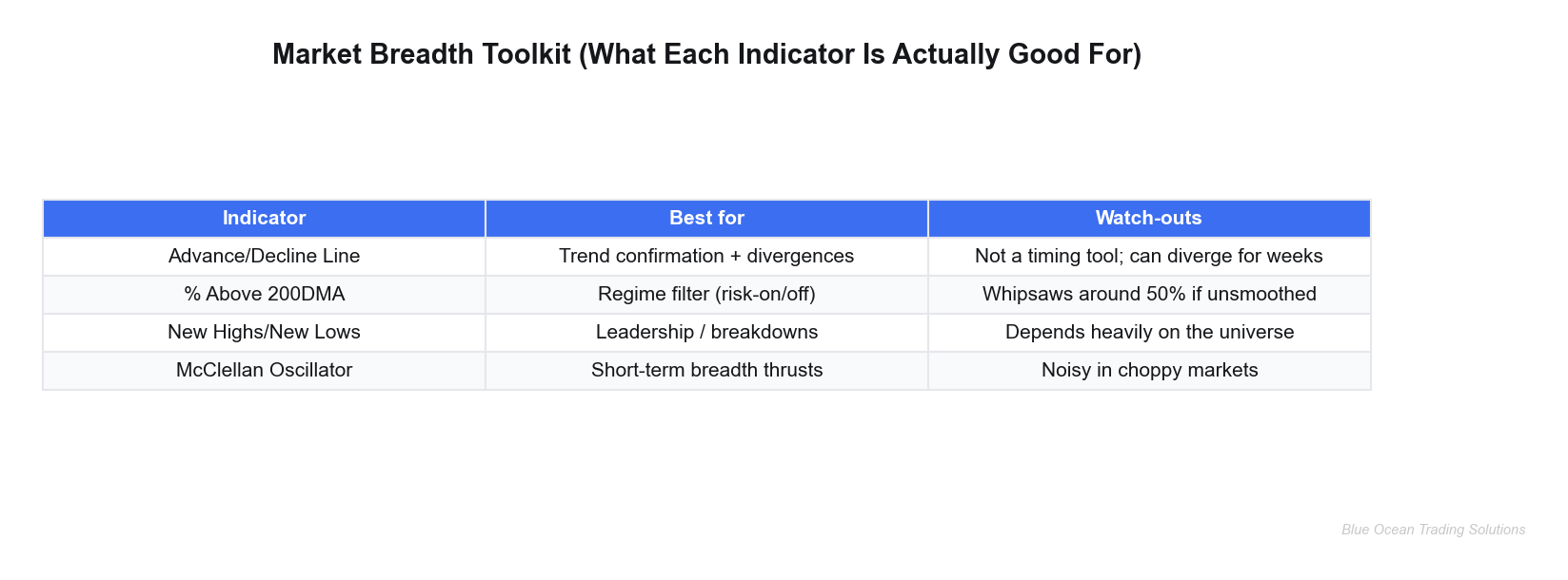
A) Advance/Decline Line (A/D)
The A/D line is the “granddaddy” breadth indicator because it tracks the cumulative net number of advancing vs declining stocks. Conceptually: if an index is trending up, you want the A/D line trending up with it. If the index makes new highs while A/D fails to confirm, participation is narrowing.
How to use it: treat it as a trend confirmation tool and a risk management signal — not an entry trigger. Divergences can persist for weeks. In practice, the “signal” is often not “sell everything,” but “tighten the playbook.”
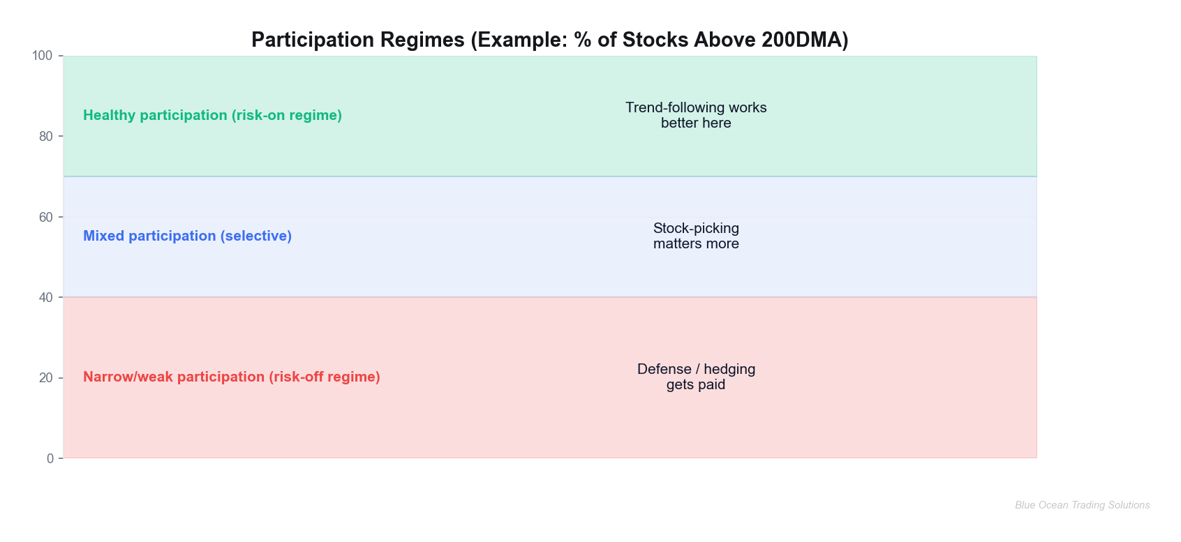
B) % of stocks above a key moving average (50DMA / 200DMA)
This is the most intuitive participation gauge: what fraction of a universe is in an uptrend (above its moving average)? The 200-day version is slow and structural — a regime filter. The 50-day version is faster and more tactical, but also noisier.
How to use it: as a risk-on / risk-off overlay for position sizing. When participation is broadly strong, trend-following tends to behave. When participation collapses, mean reversion and defense often dominate.
C) New highs / new lows
This is a leadership and breakdown indicator. Healthy uptrends typically expand the list of stocks printing fresh highs. Healthy downtrends expand new lows. When indexes are near highs but new highs are contracting, leadership is concentrating.
How to use it: to monitor leadership quality. It’s especially useful when combined with sector/ETF work: if leadership is narrowing, you can be more selective about which exposures you emphasize.
D) McClellan Oscillator (breadth momentum)
The McClellan Oscillator is essentially a momentum oscillator applied to breadth. It’s designed to capture short-term “breadth thrusts” and exhaustion. Because it’s faster, it can be helpful for timing — but it’s also more prone to noise in choppy markets.
How to use it: as a tactical supplement after you’ve established the regime with slower measures like A/D and % above 200DMA.
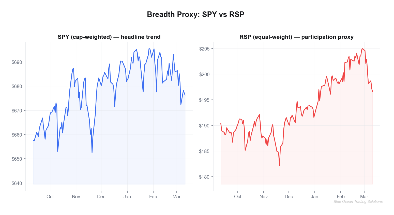
3) A real-world breadth divergence (proxy) and what it’s telling you
We don’t need perfect internals data to demonstrate the concept. A clean proxy is cap-weighted SPY versus equal-weight RSP. If SPY holds up while RSP fades, participation is thinning — fewer names are doing the heavy lifting.
Using market data through 2026-03-11, SPY finished at 676.33, while RSP finished at 196.57. Around late February into early March, the index printed a high while the participation proxy struggled — exactly the pattern you watch for when the tape looks fine but the market feels “heavy.”
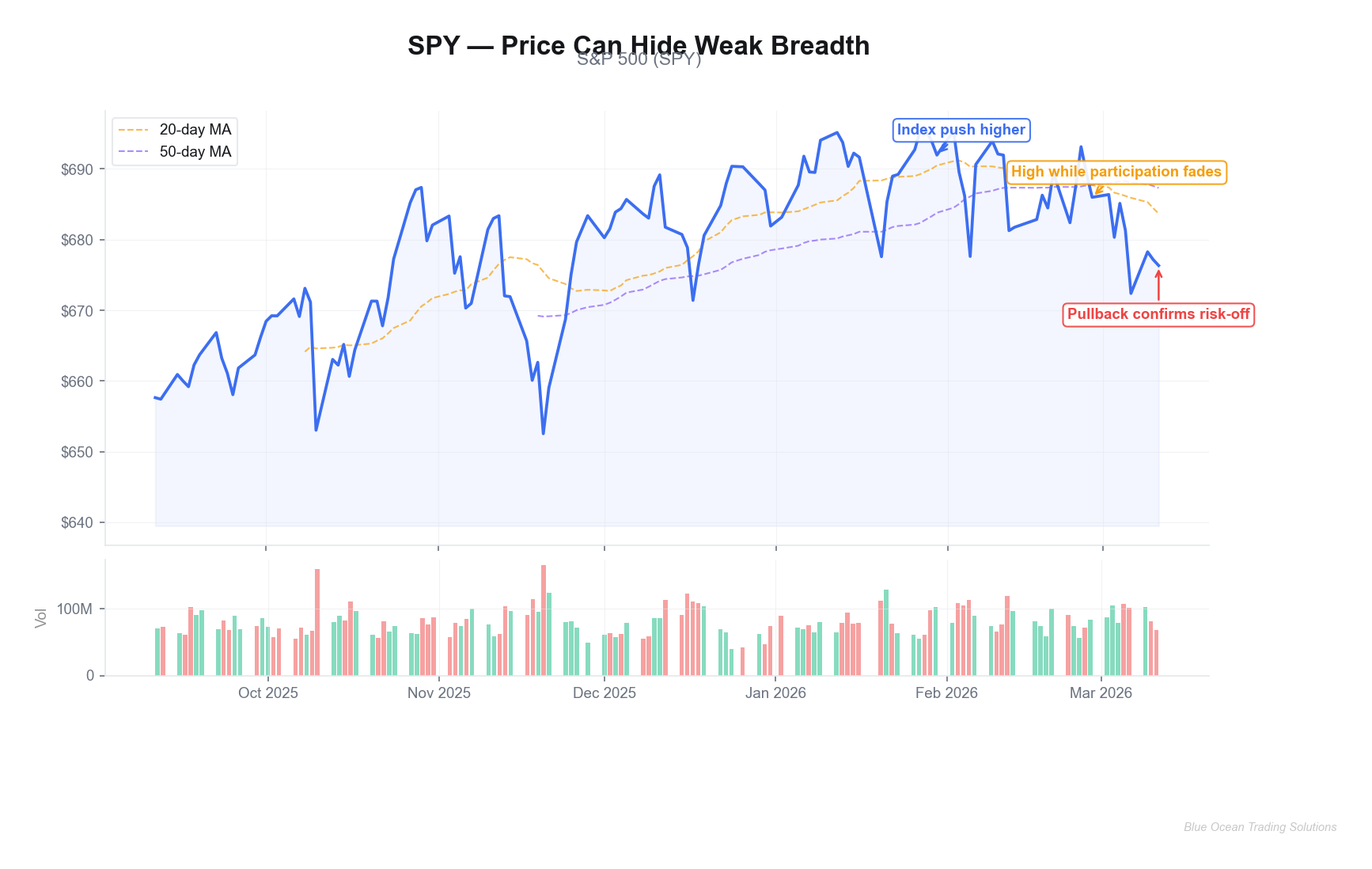
The disciplined interpretation is not “the top is in.” It’s this:
- Regime shift risk is rising: leadership is more concentrated; index-level trend-following is less robust.
- Dispersion is higher: selection matters more; “everything long” is less effective than targeted exposure.
- Stops matter more: when participation thins, breaks can travel faster.
4) Add momentum: why RSI on breadth proxies helps
Breadth is often a slow-moving context layer. Momentum tools (like RSI) can help you gauge whether weakness is stabilizing or accelerating. One simple workflow: run RSI on your breadth proxy (equal-weight ETF, advance/decline line, or % above MA series) rather than on the index itself.
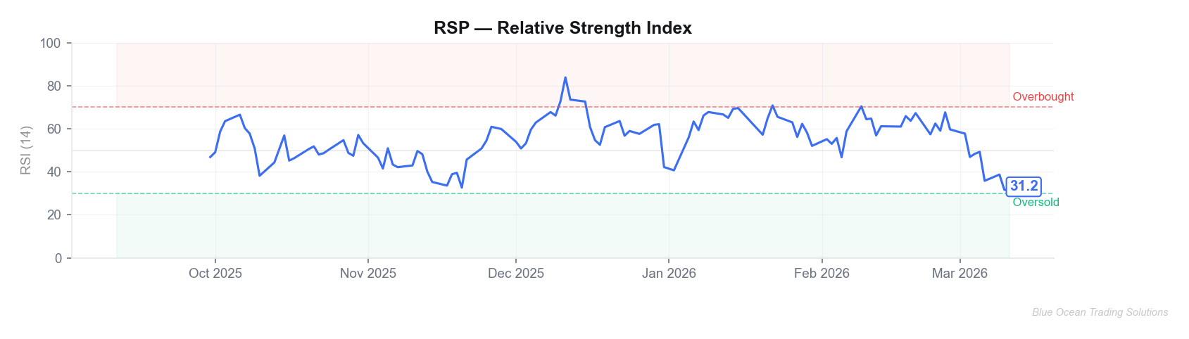
How to read it: RSI isn’t “buy at 30, sell at 70.” In breadth work, RSI is mainly about rate-of-change. If participation is rolling over and RSI can’t recover, that’s a sign the market is struggling to broaden out. If RSI stabilizes and starts making higher lows while price holds, that’s often the early “repair” phase.
5) A process you can actually run (weekly, 15 minutes)
If you want breadth to improve results, it has to be operational. Here’s a simple weekly process that fits in a single screen:
- Regime check: Is participation broadly strong, mixed, or weak? (% above 200DMA / A/D trend). Decide whether your default posture is risk-on, selective, or defensive.
- Leadership check: Are new highs expanding? If not, be cautious with “index = market” assumptions.
- Proxy check: SPY vs RSP (or QQQ vs equal-weight Nasdaq) to detect concentration. Narrow leadership suggests tighter risk controls.
- Tactical overlay: Use a fast breadth momentum tool (McClellan oscillator or RSI on proxy) to avoid buying the first dip in a deteriorating tape.
The key is that each step has an output. Breadth should change your behavior: position sizing, exposure selection, and the speed at which you take profits or cut risk.
6) Common mistakes (the fastest ways to misuse breadth)
- Using divergences as timing signals: breadth can weaken early and stay weak while price trends. Use it to adjust risk, not to call tops.
- Looking at one indicator in isolation: breadth is a dashboard. Confirmation across measures is more meaningful than one flashing red.
- Ignoring universe effects: NYSE breadth, S&P breadth, Nasdaq breadth — they can tell different stories. Be consistent with your universe.
- Forgetting why you’re using it: breadth is not a magic alpha indicator. It’s a context layer that improves decision quality.
Disclaimer: This article is for educational purposes only and does not constitute investment advice, a recommendation, or an offer to buy or sell any security. Trading involves risk, including the possible loss of principal. Past performance is not indicative of future results. Always do your own research and consider consulting a licensed financial professional.